March 28th, 2008 by Steve
Notepad++ is a free MS Notepad replacement that color codes (highlights) syntax of several languages, including HTML and CSS, Perl, PHP, Java, Javascript, SQL, ASP, C++, or even user defined! Add a shortcut to it in your “send to” folder, then you can right-click any file and open it with Notepad++. The ability to work on multiple documents at the same time (similar to “tabbed” internet browsers) and “search and replace” are just two of many other features included. This very handy tool can be found here: notepad-plus.sourceforge.net/
Posted in | 17 Comments »
June 7th, 2007 by Steve
Recently I was working on a table based site, with the entire page surrounded by a 1 px border with round corners. There were numerous table cells, spacer gifs, and four seperate images to use in the corners. Also, it didn’t take much to break it, which put a little space between a corner and a border.
I came across a great way to achieve the same effect using one small gif image and a few lines of style sheet code at the Developers Corner web site. By converting the layout using their “liquid corners” method, I was able to shorten the html files by almost 40 lines of code.
The resulting page layout is fluid (expandable), requires no tables or javascript, works in all browsers with one style sheet and no browser tests, and is very easy to use and customize. Check out my results here: http://www.tshaonline.com/
Posted in , | No Comments »
May 21st, 2007 by Steve
If you have ever use Microsoft Word to create a web page, you may have noticed a lot of extra code if you examined the HTML that was generated. If you have Word HTML that you want to clean up rather than build a whole new page from scratch, try the following steps. In Dreamweaver, start a new document, then switch to the Design view.
Open the Word generated HTML page in a browser (I prefer Firefox, but IE seems to work for this also). Select all (you can use the edit menu) and copy the page. In Dreamweaver, paste into the Design view. Switch to Code view, and you will probably notice some ole links (something like this: <A name=”OLE_LINK8″>) along with random empty tags. Remove all of these.
Next, In the Commands menu, click “Clean Up Word HTML”. This gets rid of the extra style sheet garbage created by Word.
If you want the pages to validate (w3c), links may need to be fixed. If any of them had a coded ampersand, (&), they got changed to uncoded ampersands (&) when you copied the code into Dreamweaver, so you will need to change them all back. Be careful if you use Find and Replace, because if there are already ampersands with the HTML code (&), they will be broken. You may want to just do a “Find” first, and list all the occurances of the ampersand.
As with all our tips, feel free to add a helpful comment.
Posted in | 40 Comments »
May 15th, 2007 by Steve
You may have seen old style arcade games such as Asteroids on we pages and wondered how to put one on your site. It’s easy, and free! Some of them can be found on our MySpace codes and tweaks site: myspace.xanadu-fx.com/games/
If you’re putting the code on a MySpace page, just follow the instructions on that page. If you want to put the game on a regular web page, copy the code from that page, then paste it into the place you want it. The code is set to display the game at 300×200 resolution, but these values can be increased. Just be sure the 3 to 2 ratio stays the same. For instance, the size could be WIDTH=450 HEIGHT=300, 600×400, or even 750×500. Any larger than 750 width could cause problems for visitors to your site if their display resolution is set for 800×600, so I would not recommend using anything above the 750×500 resolution. Also, if the code is not for use on MySpace, use only the embed tag so the code will look something like the following:
<EMBED src="http://www.neave.com/games/asteroids/asteroids.swf" menu="false" quality="high" WIDTH=450 HEIGHT=300 TYPE="application/x-shockwave-flash" PLUGINSPAGE="http://www.macromedia.com/go/getflashplayer/">
Here’s a look at Asteroids using width=375 and height=250:
Posted in , , | 15 Comments »
May 8th, 2007 by Steve
Posted in , | 7 Comments »
May 4th, 2007 by Steve
Posted in , | 8 Comments »
May 2nd, 2007 by Steve
This is a short guide to buying PC parts. The first step is to read reviews and narrow down your choices. My favorite site for hardware reviews is tomshardware.com (also known as THG). There are many other sites, such as AMDmb.com, arstechnica.com, socketa.com, anandtech.com and hardwarecentral.com just to name a few. If you’ve gone to the above sites and narrowed down your choices to between 2 or 3 parts, you might want to google for the part names and the word “reviews”. The important thing is to do your research. Do you want to spend all your spare time (or money) fixing your PC and/or reinstalling software and restoring data? Don’t buy parts just because they are cheap.
Once you narrow down your list, you can get a good idea of the price range for them by visiting price comparison web sites such as PriceWatch, Google Product search or PriceScan.
If you live near a Fry’s, you might be able to find your parts there for a reasonable cost. As far as online vendors, I prefer newegg.com, formerly known as Egghead Software. Their prices are usually the lowest, they ship very quickly, and their customer service is top notch. Also, you will find reviews by customers for almost every product, including any negative ones. Once you get your parts, save your receipts.
Posted in | 2 Comments »
May 1st, 2007 by Steve
If you are trying to validate your HTML with Dreamweaver or w3.org, you may have noticed errors stating there is no such attribute as “bordercolor”. Once again, CSS saves the day. The quick solution is to add a style class then insert the tables in a span:
.tbblue table, .tbblue td { border: 1px solid #0000ff; background-color: #000000; color: #00FFFF;}
<span class="tbblue"> <table width="60%" border="0" cellspacing="0" cellpadding="0">

<tr>

<td>=1=</td><td>=2=</td>

</tr>

<tr>

<td>=3=</td><td>=4=</td>

</tr>

</table></span>
Should result in this 2×2 table:
Another option does not even require the use of CSS; Just give the table a background color and cellspacing a size equal to your desired border, then give the table cells a different background color. If you put the table in a span like I did in the first example, you can avoid having to define the background color (bgcolor=”#000000″) in every table cell. Instead, add something like this to your style sheet: .tbblue td {background-color: #000000;}
Here’s the code for the non-CSS version:
<table bgcolor="#66ccff" border="0" cellpadding="0" cellspacing="1" width="50">

<tr>

<td bgcolor="#000000">=1=</td>

<td bgcolor="#000000">=2=</td>

</tr>

<tr>

<td bgcolor="#000000">=3=</td>

<td bgcolor="#000000">=4=</td>

</tr>

</table>
Posted in , | 13 Comments »
April 26th, 2007 by Steve
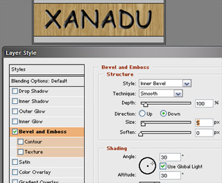
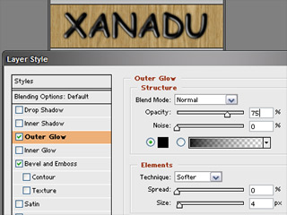
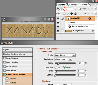
Here are a few things you can do in Photoshop with text on a wood background. First, create a new document and fill with the wood texture of your choice. Next, add your text or logo using black text (I used the typeface Comic Sans).

One thing you can do is use an inner bevel to give it a carved or engraved sort of look:

To make it look branded or burnt, add a dark outer glow:

Or, if you want to go for a more carved look, use an inner bevel with the text layer set to “multiply” so that the wood background shows inside your text:

Posted in | 15 Comments »
April 23rd, 2007 by Steve
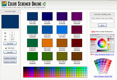
Trying to come up with a color scheme in a hurry? There are several free online tools that let you enter a color in RGB or HEX or use slidebars, then give you complimentary and harmonious schemes. Color Schemer Online is worth a look. Just enter RGB or HEX value and generate a scheme:

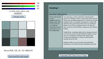
Also worth noting is the “Technicolor” tool, found at themaninblue.com as well as ElvanOnline, which can be found here. Here’s a screen shot from the Technicolor tool:

Posted in , | 8 Comments »
